.....................................................
Auchan Hypermarket
.....................................................
Development, design and visualization - for IDNT company
Project year - 2021
..................................................................
Auchan is a world famous grocery and non-food hypermarket. New formats in France have raised the bar for all other stores across Europe. Therefore, the Ukrainian branch is ripe for reformation. Especially when we have such a spoiled consumer and a colossal market of food giants.
What did the stores look like before?

The main idea was to convey the spirit of France and that very beloved Parisian atmosphere. Who else but a French company should sell the most delicious croissants with butter, we thought?
..................................................................
But let's go back to the beginning for now. What we have? A huge store with three entrances, most likely on the 0th floor of the shopping center and the entrances dictate the location of the escalators, respectively, and the flow of people, plus the exit to the parking lot is the largest flow.
That is, each of their entrances must be unique in order to give as many different experiences as possible for the consumer without even going inside.

As a result, we left two main working entrances.


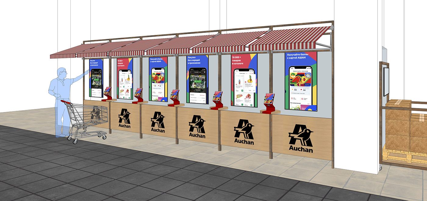
One of the entrances is a "my Auchan" zone. Where there is a mini cafe, pre-order, point of issue, a minimum set of products (yogurt, water, snacks) and of course a settlement area (cash and self-service).

The second entrance was designed for a large traffic flow from or to the parking lot, so it is wide and free and has a check-in area for getting various personal goodies and pre-ordering ready-made dishes from the "heart" of the hypermarket.
Next, we move on to the most interesting. What is the aforementioned "heart" of the store. Since we have a very large area on which there is an equally large number of different goods, it is necessary to help the consumer navigate inside the hypermarket. And here again the analogy with Paris comes to the rescue.

Paris has a main square, from which the main streets diverge. If you dig even deeper, you can draw a parallel between the two centers of the "hearts" of the city - Eiffel Tower and Arch La Defense. The first as a historical center, the second - a business center. So we have a grocery center and a center in the category of non-food and electronics. Between which lie the main streets / passages.


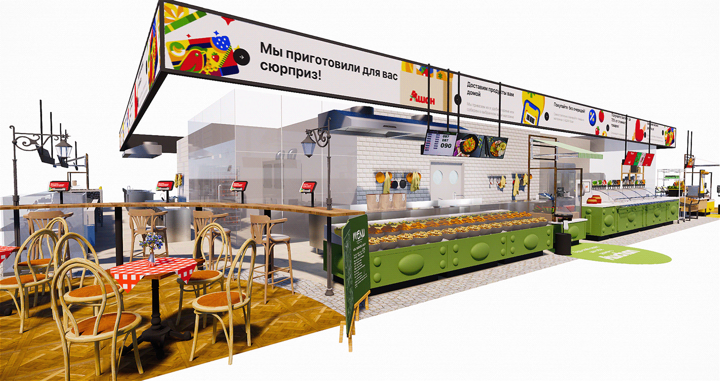
..................................................................What could look like the main food "heart" of Auchan, where the main categories of goods are concentrated. Each category has its own perks, pre-order, tasting, product grading from fresh to ready-made.


Above was a cooking zone, a salad bar and pastries.
..................................................................Now let's look at the fish and seafood department.


..................................................................As a result, after several iterations, the main "heart" of the store looks like a two-story large area. Food categories are concentrated on the ground floor - vegetables / fruits, salad bar and cooking, fresh pastries, fish and meat and related delicacies, farm products.

On the second floor there is an entertainment area for masterclasses, food lessons, team gatherings, presentations for sponsors/investors and foreign representatives and various other events. There are also comfortable places like in a cafe.

Let's go down to the 1st floor again and take a closer look at the zones. So the green zone is salads and pastries.

Blue zone - fish and sea delicacies.

Red - meat and delicacies.

And the central zone is a farmers' market.

Also, do not forget that we still have a second, no less important, zone - a small "heart" in electronics.
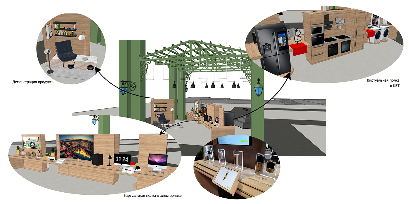
We also wanted to fill this zone with non-standard experience and interesting home compositions.
..................................................................
Another small task was to allocate a zone with foreign goods. Previously, products from this category were scattered throughout the store and it was very difficult to find any interesting, unusual products. Here we decide to combine everything into one zone and diversify it with the help of decor and pos-materials.

As a result, we got a large unusual, memorable store with a huge number of product categories, but at the same time, which is quite easy to navigate. And of course, there are many goodies in the form of digital technologies, food experience and services.
..................................................................

..................................................................
Thank you for watching.


